Design System One
An ongoing project following atomic design patterns with elements inspired by Samsung's One UI Design Guidelines. I am creating a design system for long-term skill progression and component availability for future projects. The design system will be referred to as Design System One.
 Kevin Towner•5 minute read
Breakdown
Timeframe:
- • Ongoing
Project type:
- • Design system
- • UI design
Case study:
- • HTML & CSS
Tools:
- • Figma
Introduction
Why create a design system?
Design systems on-hand are productive tools when it comes to creating consistent and reusable design patterns for user interfaces. Design systems can set branding and identity standards as well as drive realistic goals.
Problem statement
Ensuring user interface components remain consistent is challenging and time consuming due to the size and depth of many applications.
First Iteration
Quick Summary
Iteration 1 was a great starting point for building Design System One and allowed me to identify a solid foundation for building screens for menus and/or listed content.
For the 2nd iteration, I plan to working on the following..
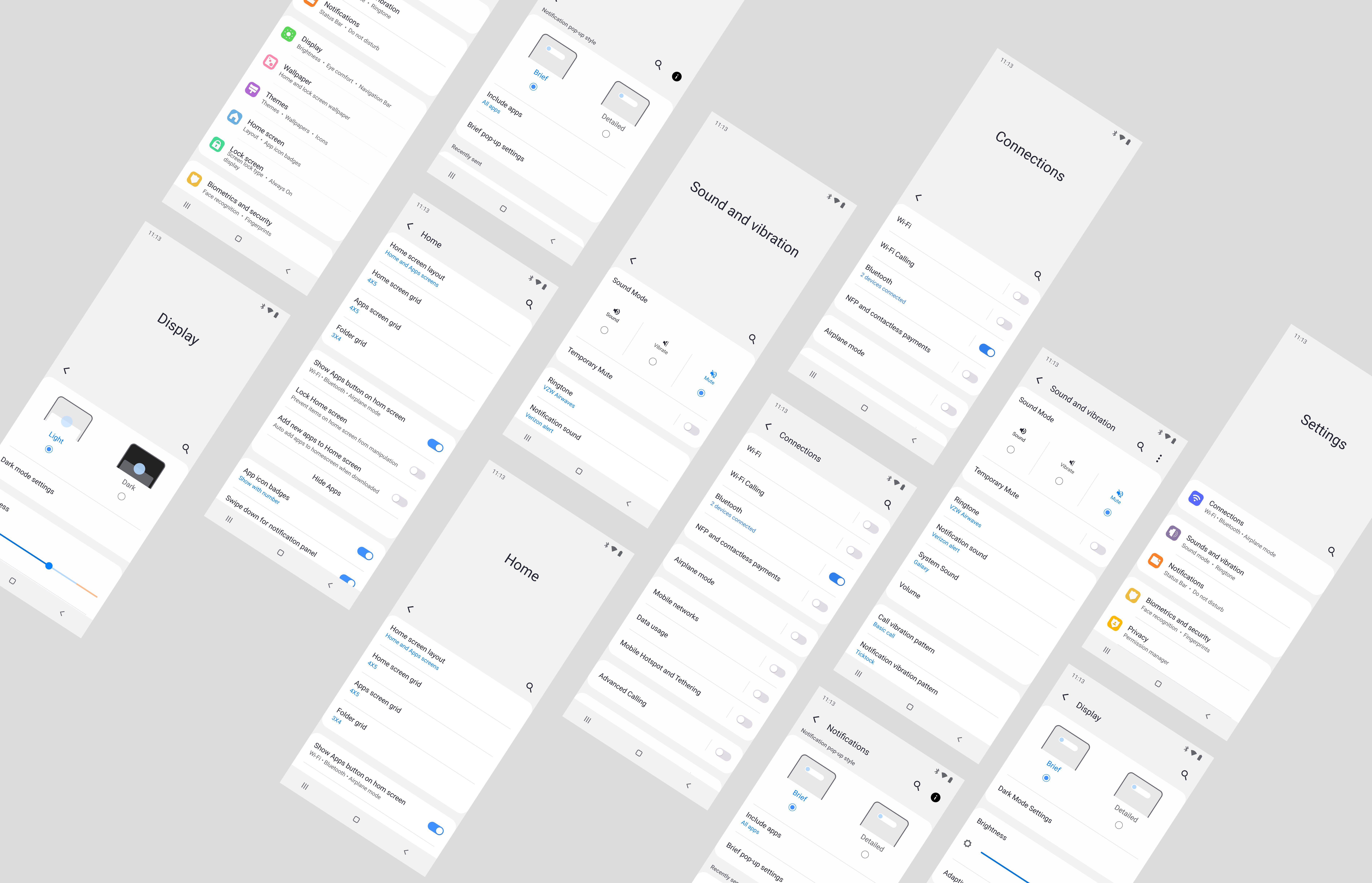
Naming Conventions
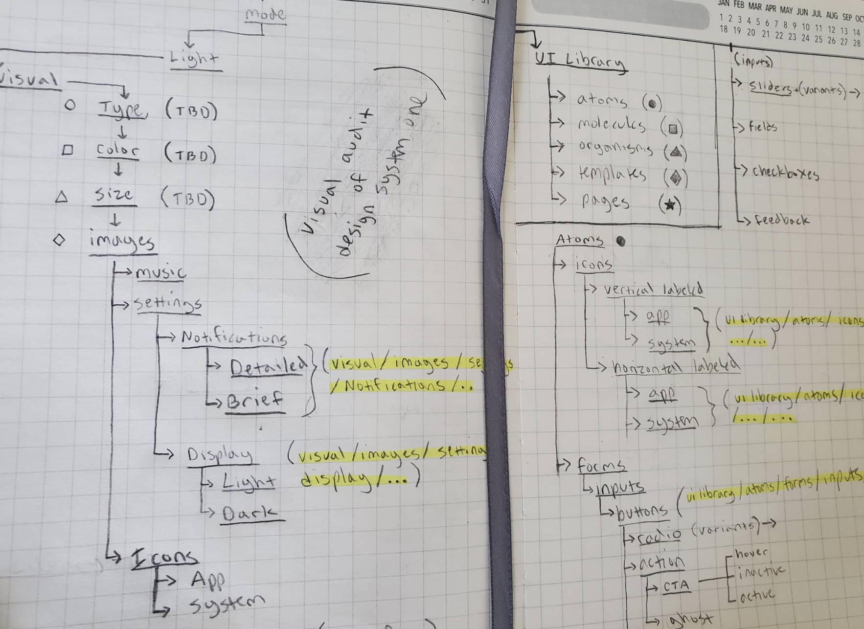 Notes and light sketches of the information in Design System One.
Naming conventions
Took visual inventory of UI components and visual elements from the first iteration and sketched new pathways for their places in Iteration Two.
Text highlighted in yellow are the improved and updated naming conventions for specific components. This process is still ongoing and hierarchy will grow as project continues
Figma Pages
Iteration 1
First iteration had 7 pages. The overabundance was due to redunancies in visual element locations.
Iteration 2
I've reduced the amount of pages in Design System One to 3 - not including 1 page serving as a test canvas, or a "workbench".
High Fidelity Icons
Iteration 2 Icons
I decided to download Samsung Galaxy S8 Icons from Raven. I took this route to enhance the polish of Design System One without spending an exorbitant amount of time on Iteration 2. Specific application icon graphics were carried over from Iteration 1 for the sake of convenience, but application icon container shapes remain consistent with all of Iteration 2.
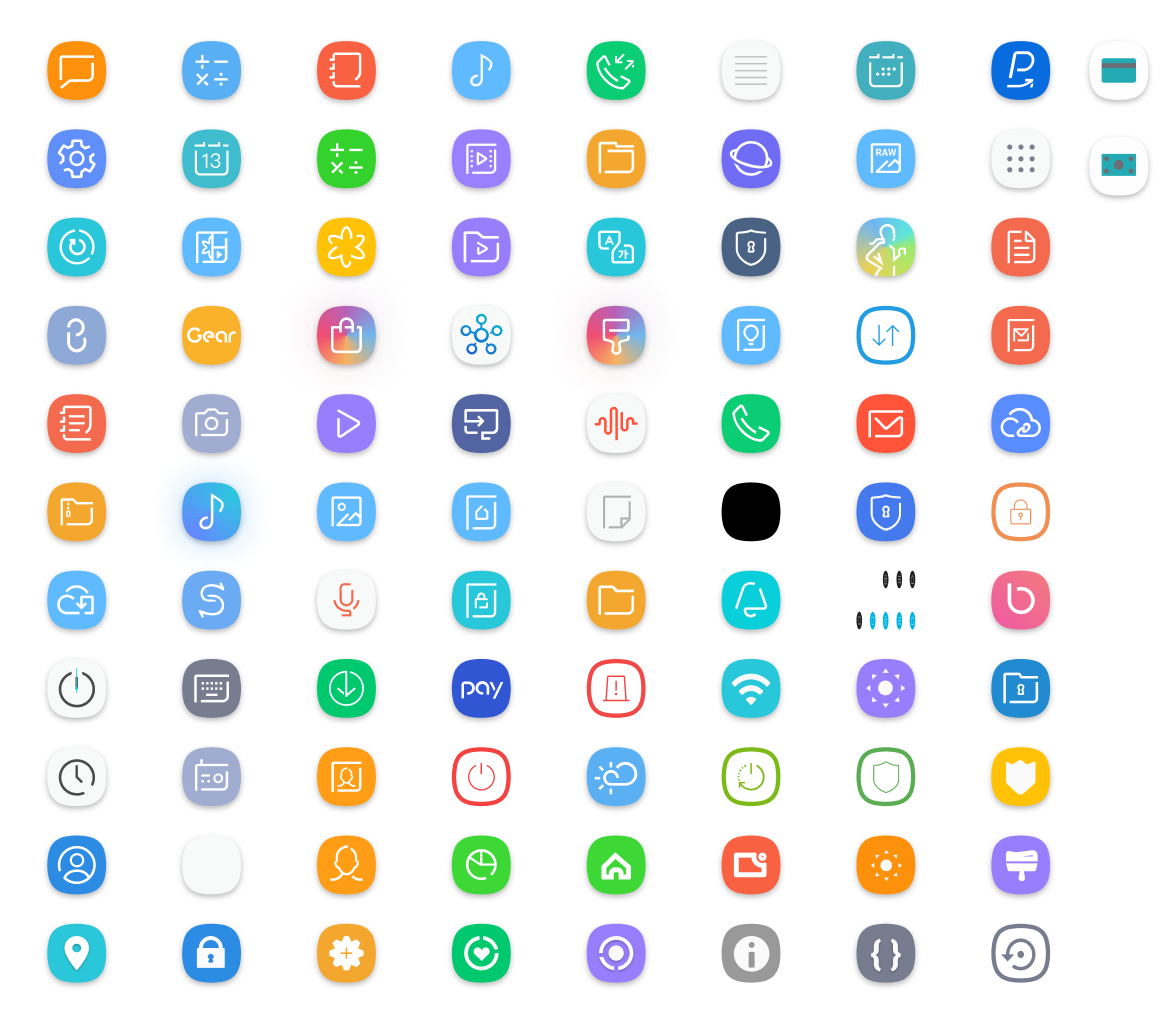 Downloaded icons
Second Iteration
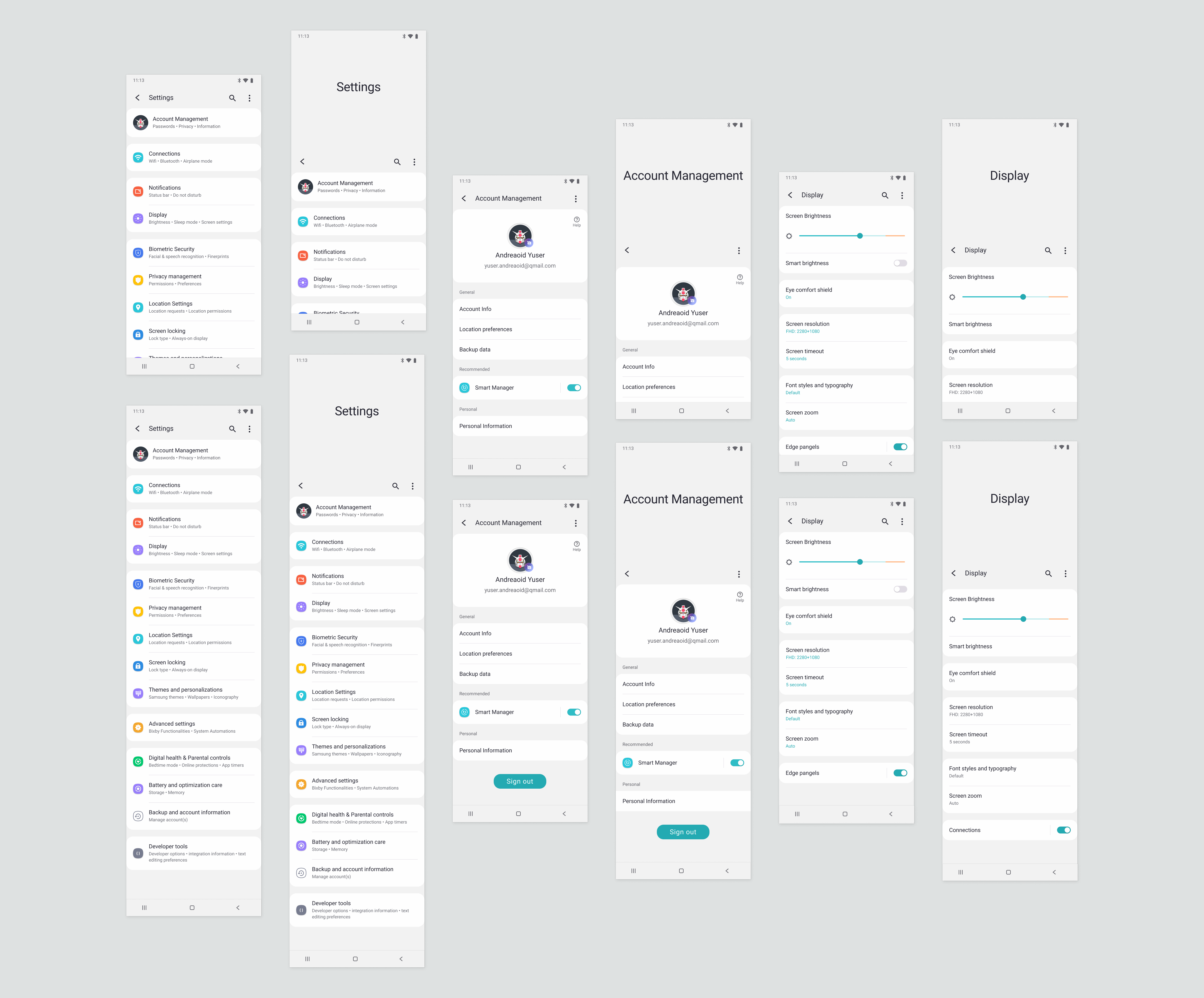
Quick Summary
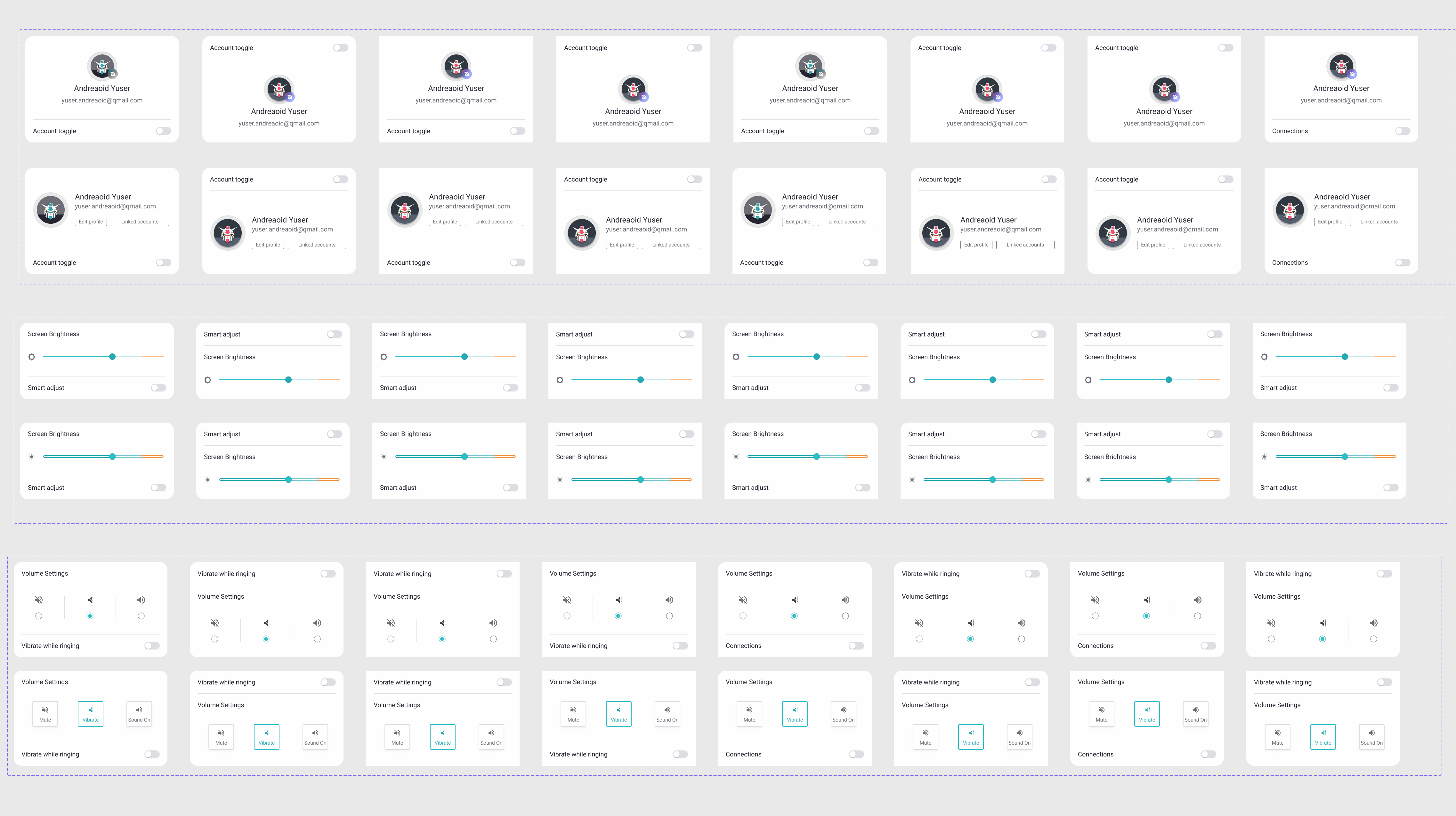
Aside from the above mentioned improvements I added two cards for account management information and screen brightness control. I also added turquoise swatches to the color styles, added additional font styles, and additional list-item types.
For the 3rd iteration, I plan to working on the following..
Addt'l Variants
List items and cards
The addition of component variants with a 'middle' property created opportunity for combining cards and list-item togethor. Card components with or without the addition of list-items each have two properies (order & toggle) with a maximum of 8 different variants per card component.
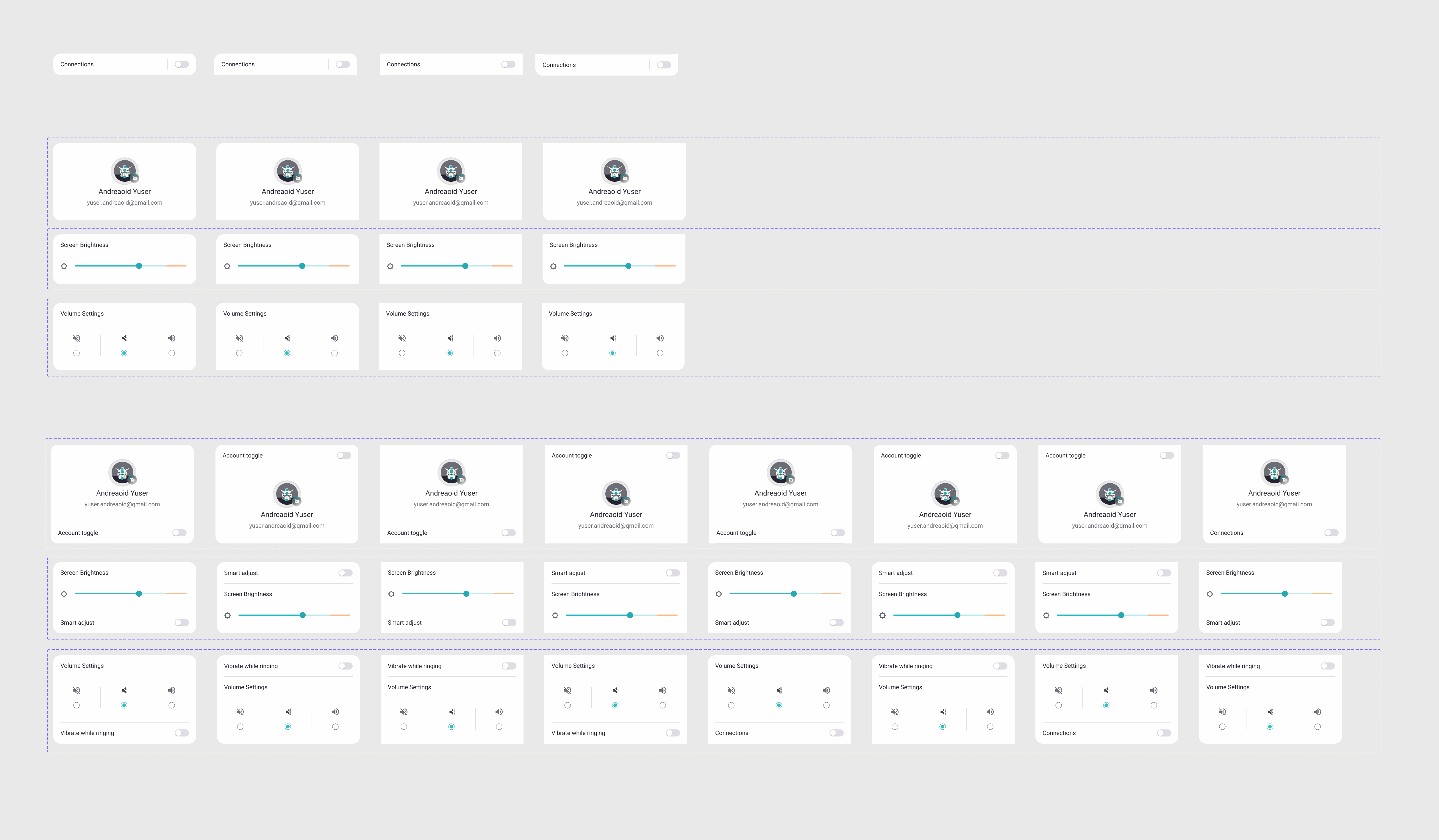 List item and card variant combinations
Templates
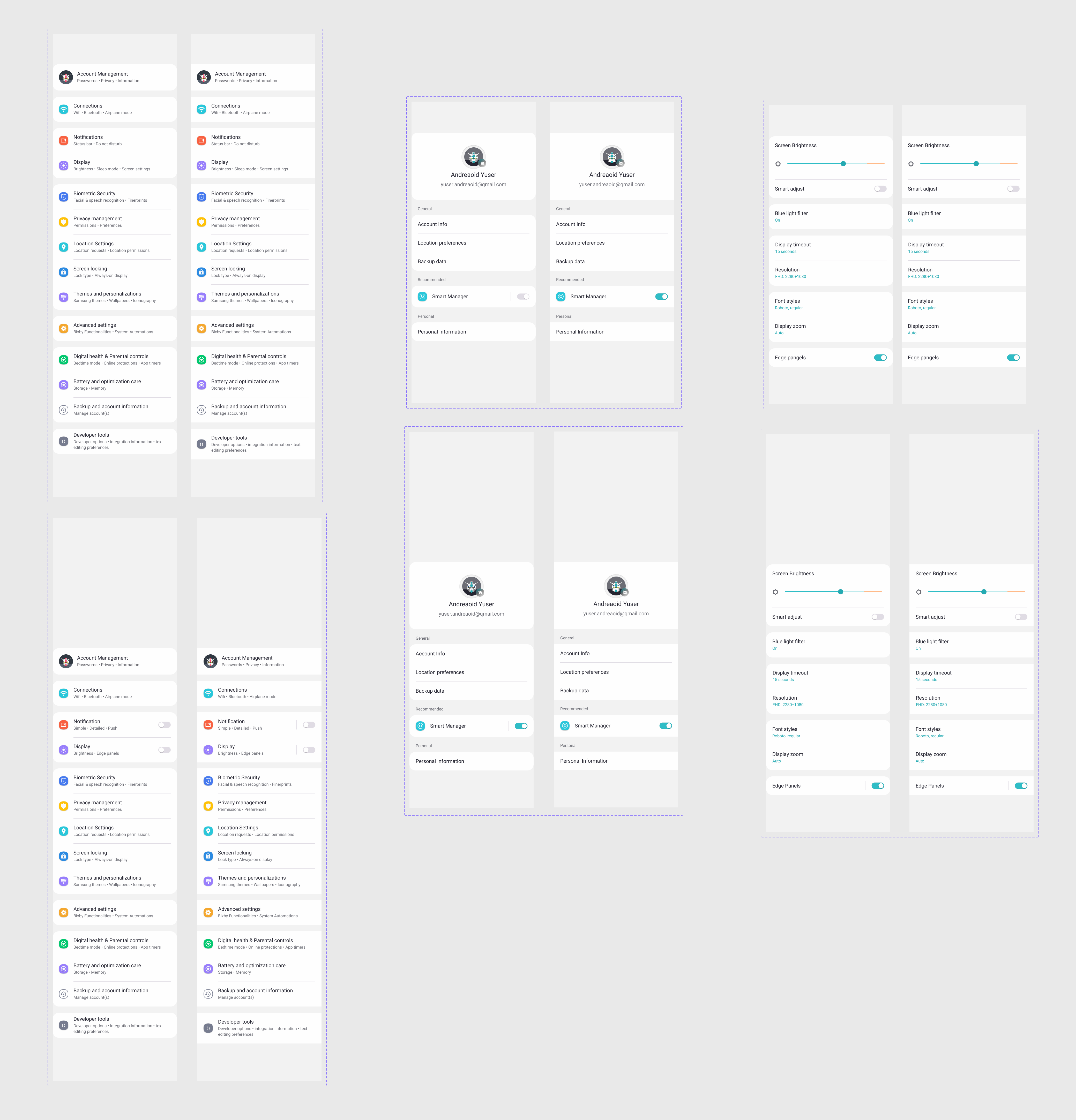 Template components and variants
Template variants
There are a three screens (home, account management, and display), represented by two different templates (scrolled & extended) - each having two different variants (0 & 24). The variant property is currently called 'radius' and each template is a '0' or '24' variant.
The '24' variants have curves to their edges (border radius of 24). Likewise, the '0' variants contain elements that have a sharp edge to their borders (border radius of 0). The 24 variant is more aligned with One UI Design Guidelines whereas the 0 variant is generic while maintaining a simple and clean look.
Third Iteration
Quick Summary
Iteration 3 increased the volume and depth of templates and screen states. Three screens (home, account management, and display) illustrated by 6 different screen states (scrolled & extended). Each screen state houses two variants (0 & 24.).
For the 4th iteration, I plan to working on the following..
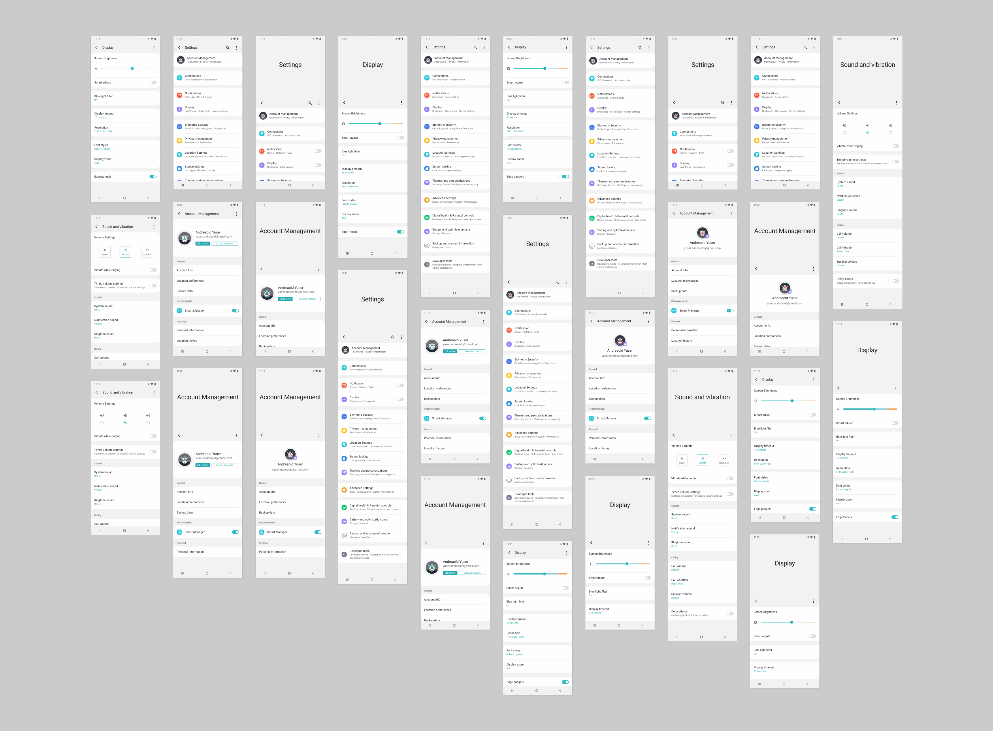
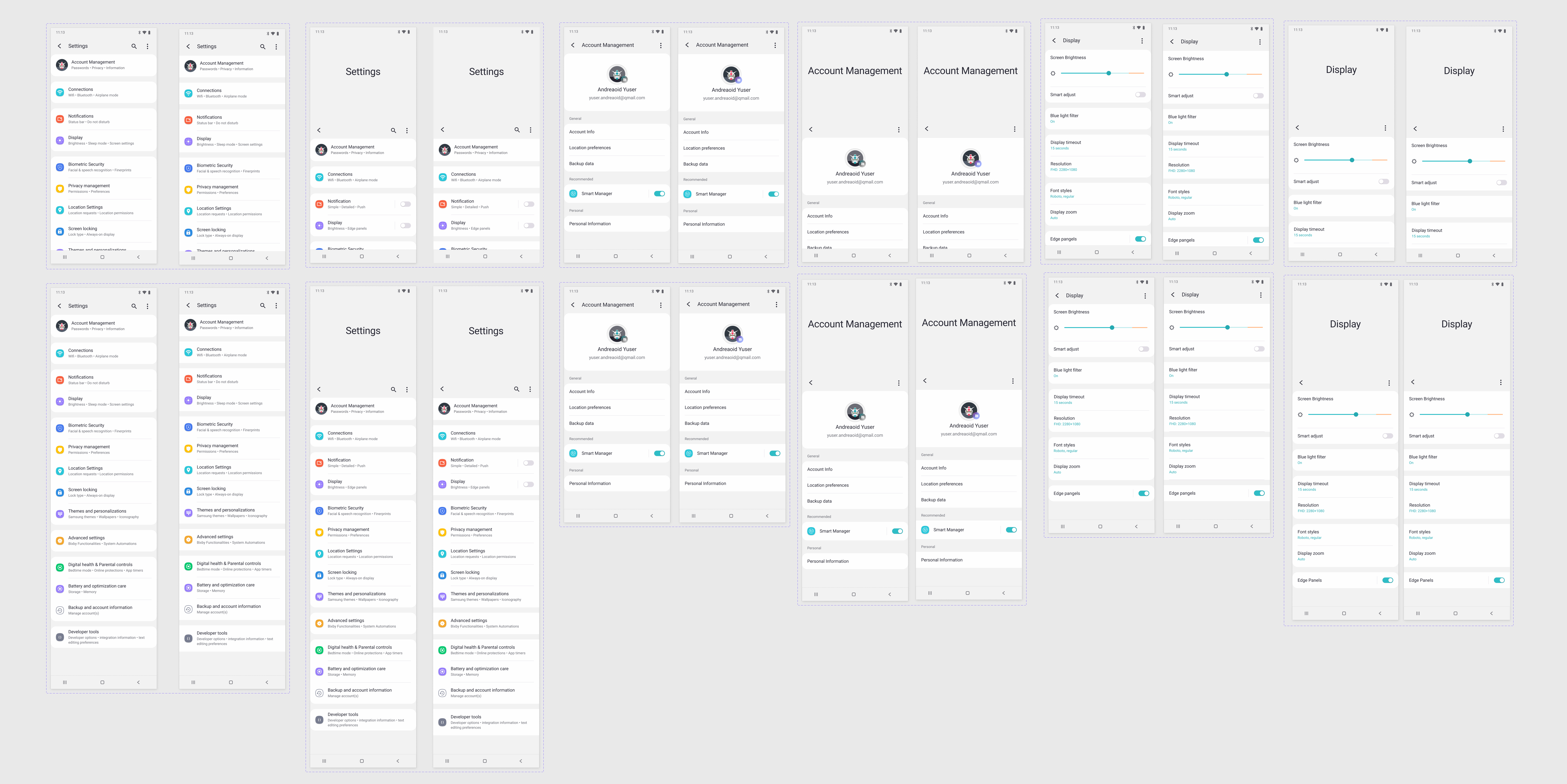 Screen components and variants
Diversifying Design
 Screen components and variants
Additional card components
Additional variant properties called "type" with values of either "samsung" or "alternate". I also added an additional variant called "alignment" with values of "center" or "left".
Menu Items
Additional menu items were added in order to add more flexibility to the design system. Added Menu items are purposed for transaction and online ordering experiences.
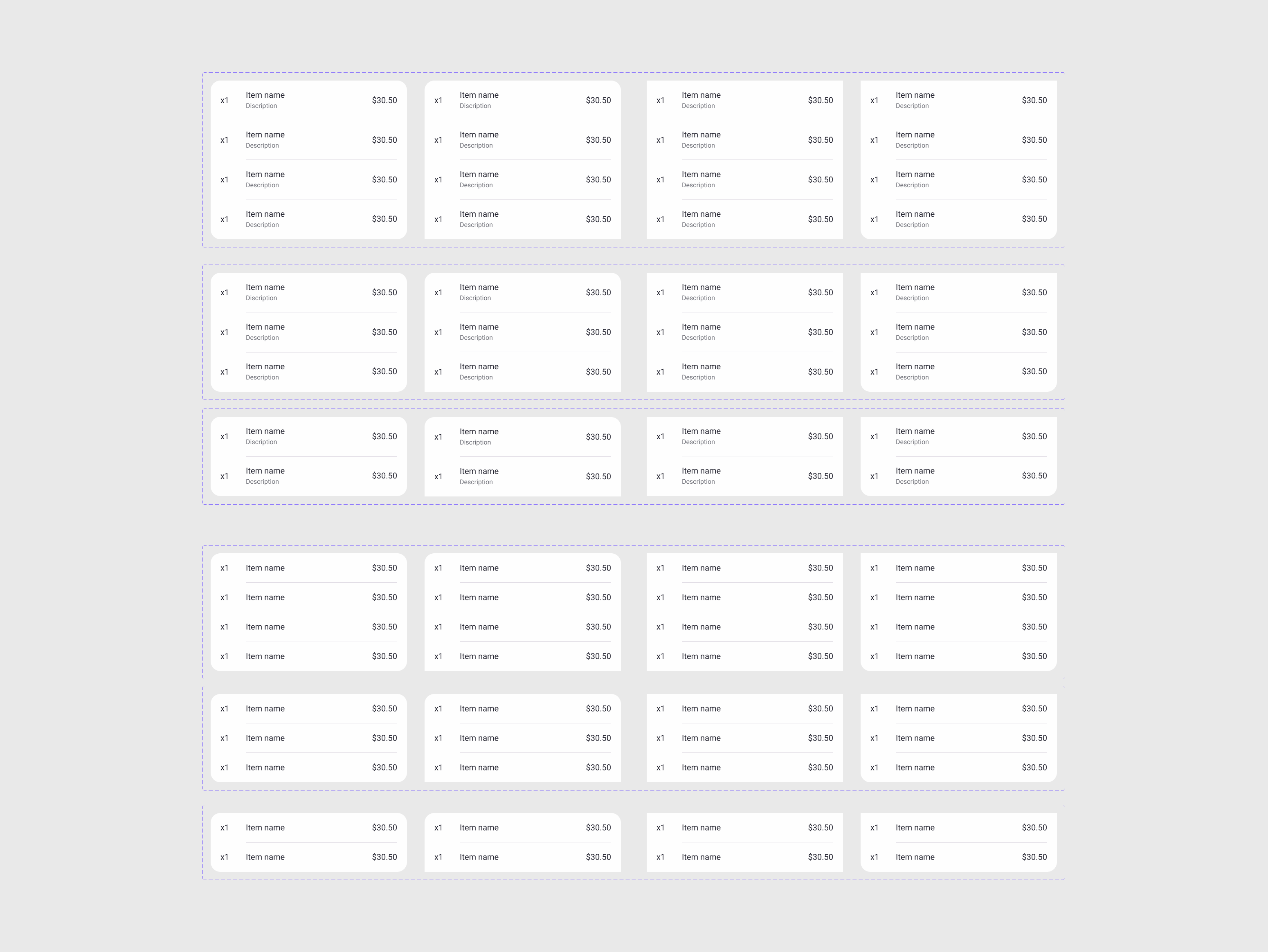 Additional menu items from Iteration 4
 Screen examples from Iteration 4
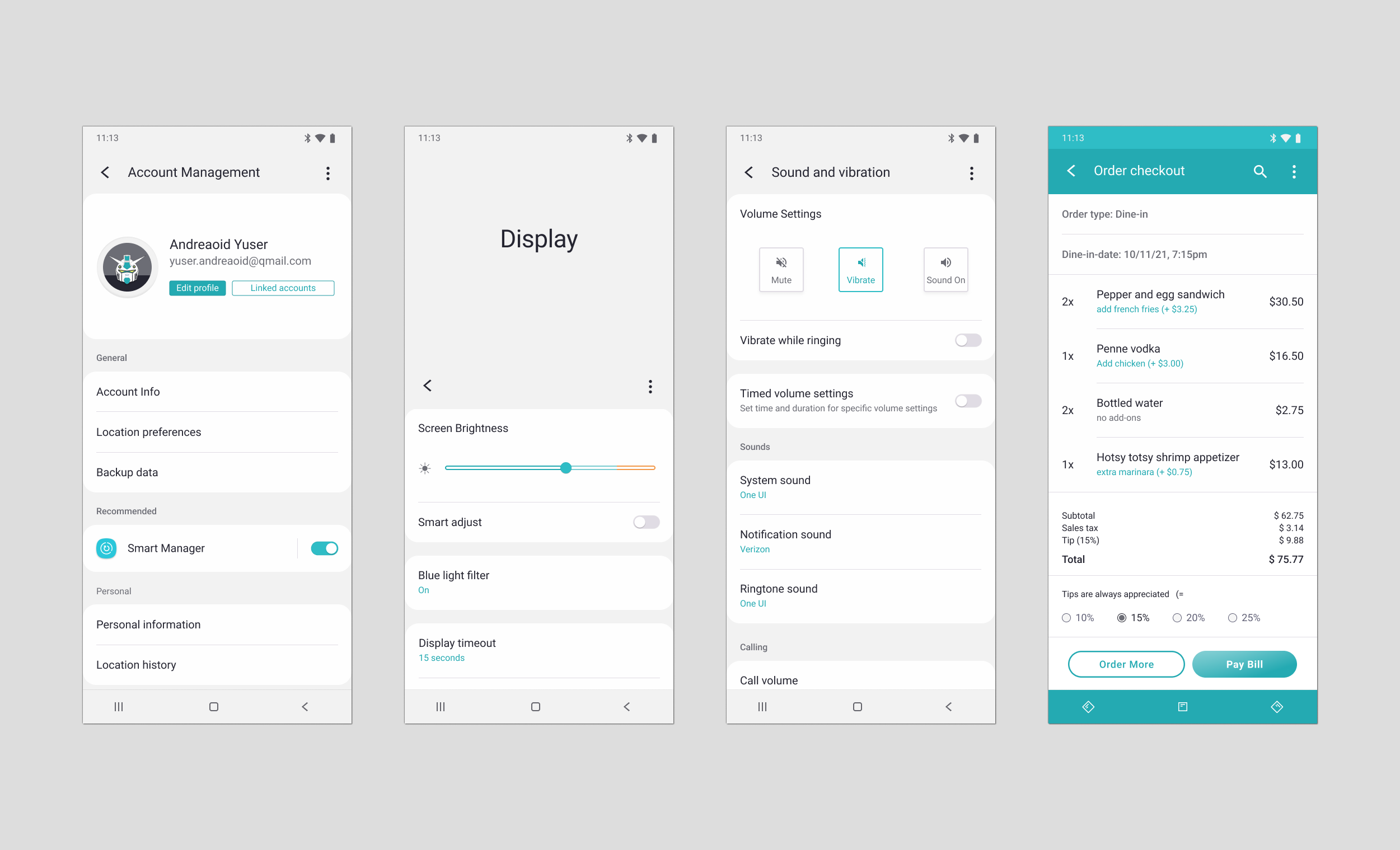
Example Screens
Example screens utilizing the additional card and menu-item components. Included is an example of an order checkout screen made with the help of Design System One. Order checkout screen includes font styles, colors, menu-item components, navigation components, icons, and layout from Design System One.
Fourth Iteration
Quick Summary
Iteration 4 showcases Design System One and the ability to utilize design system components to accomodate different uses and identities.
 Iteration 4 screens